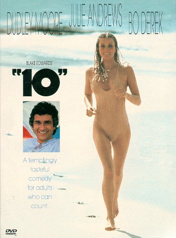
 Not since Bo Derek has a "10" been this closely scrutinized!
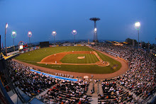
 2010 marks the 10th season of Cyclones baseball, and as such, we have created the logo above to commemorate the landmark campaign. (Let's get this out of the way early...it's the 10th season, not the 10th anniversary. Count it out on your fingers if you're mathematically challenged, like me.)
Keep in mind from here on out that when I say "we," I really mean KJ. Several of us have had input along the way, but it's really KJ's baby. It's his creation, and I think he did an amazing job with it.
Now, the production of this logo was no easy task. The 10-year mark will be everywhere the Cyclones are this summer, so we needed it to be perfect. It not only had to be eye-catching and cool-looking...it had to convey a message and represent our brand, as well.
The final product does it all for a variety of reasons. Let's start at the top and work our way down. The Brooklyn script evokes the borough's storied past, while the "Cyclones" in the tail injects the present and the future. The blue, red, and gold color scheme is that of the traditional Cyclones uniform, and the colors that dominate the Coney Island landscape. The logo's primary shape represents a baseball diamond, while the background imagery depicts the Coney Island skyline that is infused into the fabric of the ballpark and the team itself (and vice versa). The sunburst behind the skyline gives the logo depth from within, and symbolizes the continuing rise (or dawn) of Brooklyn baseball. The big, bold number 10 is the unmistakable focal point of the image, and the banner containing the word "seasons" ties in a carnival feeling that again hearkens to Coney.
See? There's more to this puppy than just a pretty face.
The process was not an easy one. There were lots of eyes and lots of opinions on it, and the logo went though countless iterations, tweaks, and wholesale changes before we eventually arrived at the one we now have.
As a loyal reader of the blog, we'll give you an exclusive extra -- the opportunity to check out some of the versions that didn't make the cut. You'll see some completely different directions, and some of the evolution of similar ideas. We liked several of these as well, but for a variety of reasons, they just didn't have the right fit or feel. Take a look:
 In the end, I think we came up with a winner. The final product is one that we're all thrilled with, and we hope you like it, too. You'll be seeing a lot of it this summer, as we celebrate the 10th season of Cyclones baseball!
-- Dave
Share


4 comments:
The New Logo looks great
10 great seasons of Cyclones Baseball
Just love it!
Love it! Great work incorporating all those elements into the logo.
Thanks for including images of the top choices in the story - it's fun to see what was and was not selected and get an insight into why. Kudos to KJ on the design!
I think this is an awesome idea. Witty, relevant, and dialogue inducing. The strongest aspect is probably it's agility. The identity is malleable, a perfectly orchestrated identity that can be adapted to a variety of future situations and campaigns.
Post a Comment